
Hiệu ứng hover slide image siêu đẹp
Hiệu ứng hover slide image siêu đẹp, hiệu ứng sẽ giống video bên dưới
Xem thử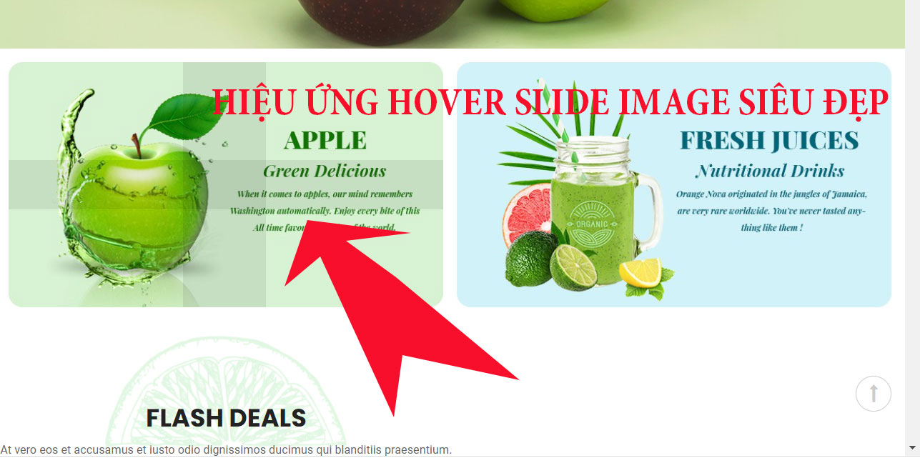
Sau đây là code:
|
1 2 3 4 5 6 7 8 9 10 11 12 13 14 15 16 17 18 19 20 21 22 23 24 25 26 27 28 29 30 31 32 33 34 35 36 37 38 39 40 41 42 43 44 45 46 47 48 49 50 51 52 53 54 55 56 57 58 59 60 61 62 63 64 65 66 67 68 69 70 71 72 73 74 75 76 77 78 79 80 81 82 83 84 85 86 87 88 89 90 91 92 93 94 95 96 97 98 99 100 101 102 103 104 105 106 107 108 109 110 111 112 113 114 115 116 117 118 119 120 121 122 123 124 125 126 127 128 129 130 131 132 133 134 135 136 137 138 139 140 141 142 143 144 145 146 |
<head> <meta charset="UTF-8"> <meta name="viewport" content="width=device-width, initial-scale=1"> <title>Hiệu ứng hover slide image siêu đẹp - Code mẫu</title> <style> .mrtung-out { max-width: 1110px; margin: 0 auto; display: flex; flex-flow: row wrap; } .block_content { flex: 1 1 25%; padding: 10px; } *{ box-sizing: border-box; margin: 0; padding: 0; } img { max-width: 100%; } .effect { overflow: hidden; position: relative; -webkit-transition: all 0.35s ease; -moz-transition: all 0.35s ease; -ms-transition: all 0.35s ease; -o-transition: all 0.35s ease; transition: all 0.35s ease; text-align: center; } .effect a { display: block; overflow: hidden; position: relative; } .effect a:before { content: ""; bottom: 0; left: 50%; right: 51%; top: 0; filter: alpha(opacity=100); -ms-filter: "progid:DXImageTransform.Microsoft.Alpha(Opacity=100)"; -webkit-opacity: 1; -moz-opacity: 1; -ms-opacity: 1; -o-opacity: 1; opacity: 1; position: absolute; background: rgba(0,0,0,.1) none repeat scroll 0 0; } .effect a:after { content: ""; bottom: 50%; left: 0; right: 0; top: 50%; filter: alpha(opacity=100); -ms-filter: "progid:DXImageTransform.Microsoft.Alpha(Opacity=100)"; -webkit-opacity: 1; -moz-opacity: 1; -ms-opacity: 1; -o-opacity: 1; opacity: 1; position: absolute; background: rgba(0,0,0,.1) none repeat scroll 0 0; } .effect:hover a:before { left: 0; right: 0; filter: alpha(opacity=0); -ms-filter: "progid:DXImageTransform.Microsoft.Alpha(Opacity=0)"; -webkit-opacity: 0; -moz-opacity: 0; -ms-opacity: 0; -o-opacity: 0; opacity: 0; -webkit-transition: all 700ms ease-in-out 0s; -moz-transition: all 700ms ease-in-out 0s; -ms-transition: all 700ms ease-in-out 0s; -o-transition: all 700ms ease-in-out 0s; transition: all 700ms ease-in-out 0s; } .effect:hover a:after { bottom: 0; top: 0; filter: alpha(opacity=0); -ms-filter: "progid:DXImageTransform.Microsoft.Alpha(Opacity=0)"; -webkit-opacity: 0; -moz-opacity: 0; -ms-opacity: 0; -o-opacity: 0; opacity: 0; -webkit-transition: all 700ms ease-in-out 0s; -moz-transition: all 700ms ease-in-out 0s; -ms-transition: all 700ms ease-in-out 0s; -o-transition: all 700ms ease-in-out 0s; transition: all 700ms ease-in-out 0s; } </style> </head> <body> <div class="mrtung-out"> <div class="block_content"> <div class=" effect"> <a href="#"> <img class="img-fluid w-100" src="https://fcwordpress.net/wp-content/uploads/2021/04/4_OnlineCourse-Alex_Crowly.jpg" alt="banner left" title="banner left"> </a> </div> </div> <div class="block_content"> <div class=" effect"> <a href="#"> <img class="img-fluid w-100" src="https://fcwordpress.net/wp-content/uploads/2021/04/4_OnlineCourse-Alex_Crowly.jpg" alt="banner left" title="banner left"> </a> </div> </div> <div class="block_content"> <div class=" effect"> <a href="#"> <img class="img-fluid w-100" src="https://fcwordpress.net/wp-content/uploads/2021/04/4_OnlineCourse-Alex_Crowly.jpg" alt="banner left" title="banner left"> </a> </div> </div> <div class="block_content"> <div class=" effect"> <a href="#"> <img class="img-fluid w-100" src="https://fcwordpress.net/wp-content/uploads/2021/04/4_OnlineCourse-Alex_Crowly.jpg" alt="banner left" title="banner left"> </a> </div> </div> </div> </body> |
có thể bạn cần xem:
- Kỹ thuật css cho checkbox input đẹp hơn [ 05/05/2023 10:32 ]
- Css để tăng khoản cách giữa các dot trong border [ 13/12/2022 10:16 ]
- Function xử lý upload to media wordpress [ 18/07/2022 11:11 ]
- Function tạo rating star sử dụng dashicon từ wordpress [ 03/04/2022 03:02 ]
- Css menu vertical danh muc đơn giản [ 20/02/2022 12:40 ]
- Html và css section với title, description và card siêu đơn giản [ 17/02/2022 11:22 ]
- Hiệu ứng css đẹp transform scale3d [ 10/02/2022 04:05 ]
- CSS Animations hoạt động như thế nào [ 14/01/2022 03:49 ]
- Cách set size image cùng kích thước không bị vỡ hình với css [ 03/01/2022 03:12 ]
- Code phóng to thumbnail khi hover với CSS3 [ 02/01/2022 07:15 ]


-

Thiết kế theme wordpress phần 8
Nếu bạn chưa xem phần 7 thì xem theo link dưới
-

Thiết kế theme wordpress phần 7
Thiết kế theme wordpress phần 6 Chúng ta tiếp
-

Thiết kế theme wordpress phần 6
Nếu chưa xem phần 5 thì xem theo link dưới nhé
-

Thiết kế theme wordpress phần 5
Nếu bạn chưa xem phần 4 thì xem theo link dưới
-

Thiết kế theme wordpress-phần 4
Đã khá lâu rồi tôi mới viết bài, vì là quá
-

Function xử lý upload to media wordpress
Function xử lý upload to media wordpress: function sau đây mình
-
Function get ip address
Dưới đây là function lấy địa chỉ ip, Để đây anh
-
Thay thế file_get_contents
Thay thế file_get_contents: đôi lúc gặp những hosting function file_get_contents không
-
Code tích hợp acf vào theme và plugin
Xin lưu ý tài liệu này chỉ dành cho anh em
-

Một số function thường dùng khi làm theme wordpress (some functions popular for work do theme worpdress)
Một số function thường dùng khi làm theme wordpress (some functions
Hotline: 0912 889 416
-


Mọi sự sao chép xin ghi rõ nguồn là fcwordpress.net
Chuyên trang về wordpress: hướng dẫn thiết kế theme, plugin, thủ thuật wordpress